
What you will get
The ability to read the panel in ten seconds knowing what each number counts — and what it does not.
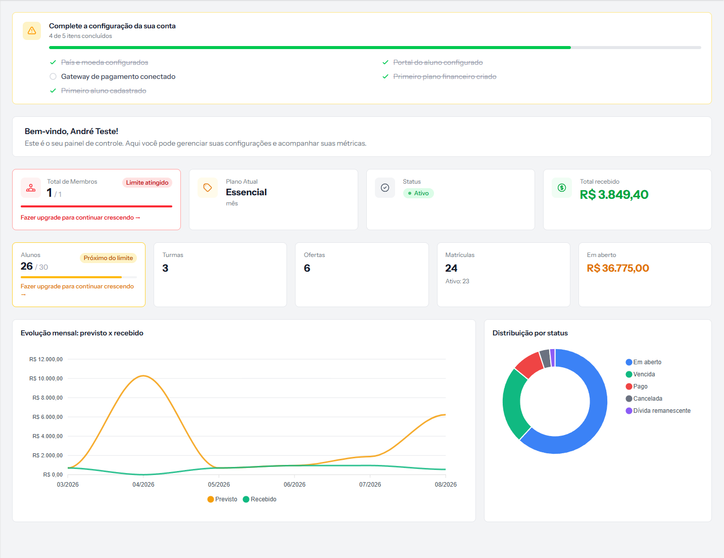 Top to bottom: the setup list, four account cards, five operations cards and two charts. The screenshot is from the Portuguese panel; the layout is the same in English.
The list at the top
Complete your account setup tracks five first-day items: country and currency, student portal, receiving connected, first price table and first student.
It disappears when all five are done. While anything is outstanding, it stays at the top — deliberately.
The four account cards
| Card | What it carries |
|---|---|
| Total Members | People on your team with access, and the plan limit |
| Current Plan | The plan you contracted |
| Status | Your subscription's standing |
| Total received | Everything that has come in, ever |
The five operations cards
| Card | What it counts |
|---|---|
| Students | Students on file, and the plan limit |
| Cohorts | Cohorts created |
| Offerings | Products on file |
| Enrolments | All enrolments, with Active: N below |
| Outstanding | Everything still to come in |
Two of these deserve attention.
Enrolments shows the historical total; the number that matters day to day is the Active: N just below it. A school with 24 enrolments and 23 active had a cancellation — not 24 students studying.
Outstanding adds up open instalments, overdue ones and remaining debt. It is money still to come, not just what is within its deadline. A school with heavy arrears sees a high number here and mistakes it for a healthy book.
Monthly trend: forecast vs received
Two lines per month: what fell due and what came in.
The gap between them is the most useful reading on the panel. Lines together, and collections are working. Lines drifting apart month by month, and arrears are growing.
Distribution by status
The doughnut shows how much money sits in each status.
The colours carry no fixed meaning — read the legend. The system paints the slices by size, not by sense: the largest gets blue, the second green, the third red, and so on. In the image above, green is "Overdue" and red is "Paid" — the opposite of what intuition says.
This changes from school to school and month to month as the amounts move. Logged for correction. Until then: the legend rules, the colour does not.
What the panel does not answer
- Who owes — that is the financial report.
- How much came in this month — "Total received" is cumulative, from the beginning.
- Which instalments fall due next week — also the report.
The panel is the thermometer. The report is the diagnosis.
If something goes wrong
The members and students cards show no limit. Your plan has no limit rule for that item.
The monthly chart is empty. There are no instalments with a due date in the period. A new school sees this until its first enrolment.
The student number does not match the list. The list has filters; the card counts everyone on file. Check you do not have the Active filter on.
Reviewed on · view as plain text